
Year
Client
Industry
Service
As Lead Product Designer, I was responsible for the end-to-end direction of the system.
I initiated the idea, pitched it internally, defined the framework, led design decisions, coordinated with developers, and introduced the system to the broader design team through workshops and practical onboarding. I also supervised how the system evolved in real production and ensured it stayed aligned with both the brand and implementation needs.
where new promo pages were launched continuously.
from the initial concept to adoption across the team.
Design Tokens → Atoms → Molecules → Organisms → Templates → Pages.
solving roughly 90% of typical promo page needs.
with reusable Figma components, guidelines, and a parallel implementation base for developers.
allowing around 90% of blocks to adapt to tablet and laptop breakpoints without manual redesign.
including vendors creating promo pages for the M.Video platform.
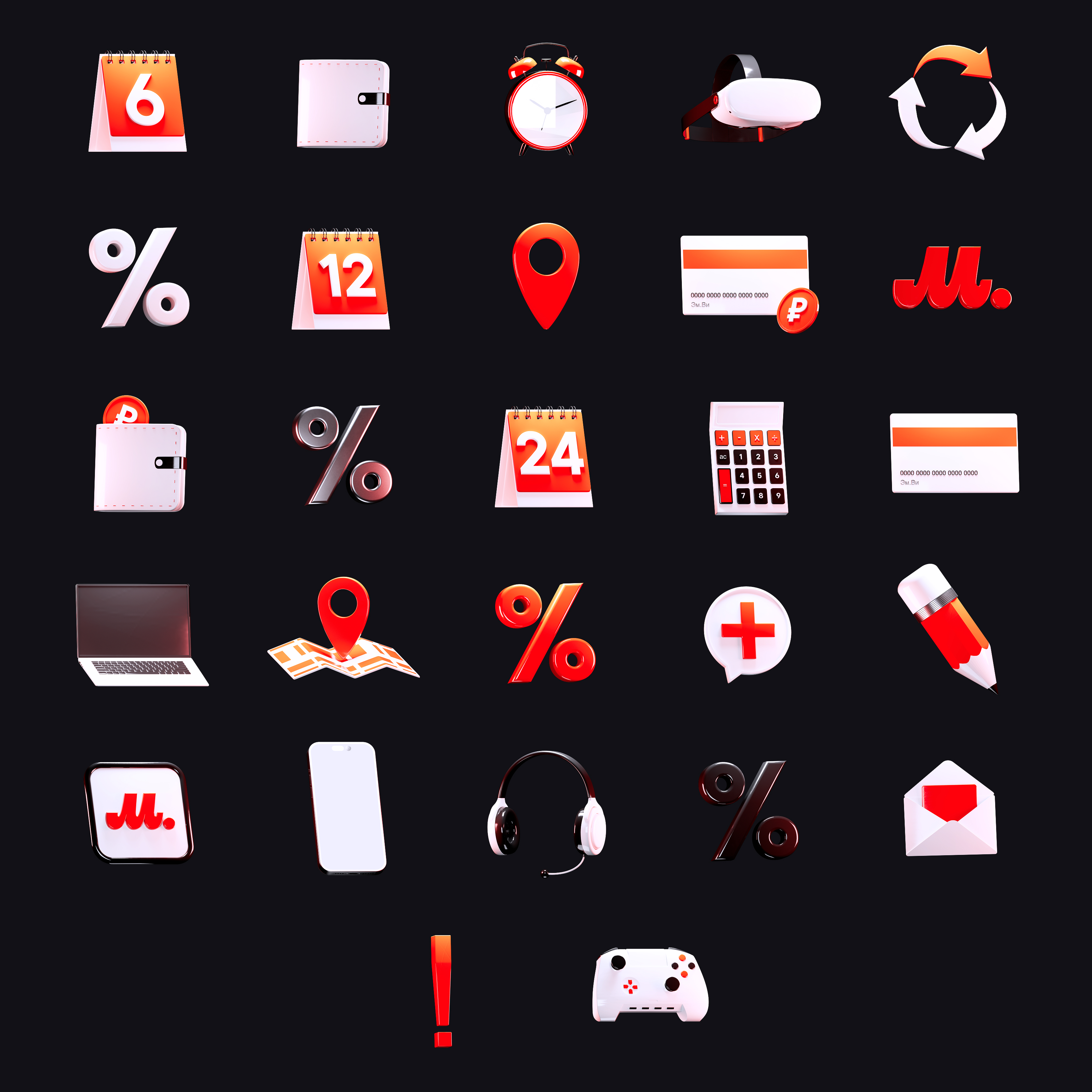
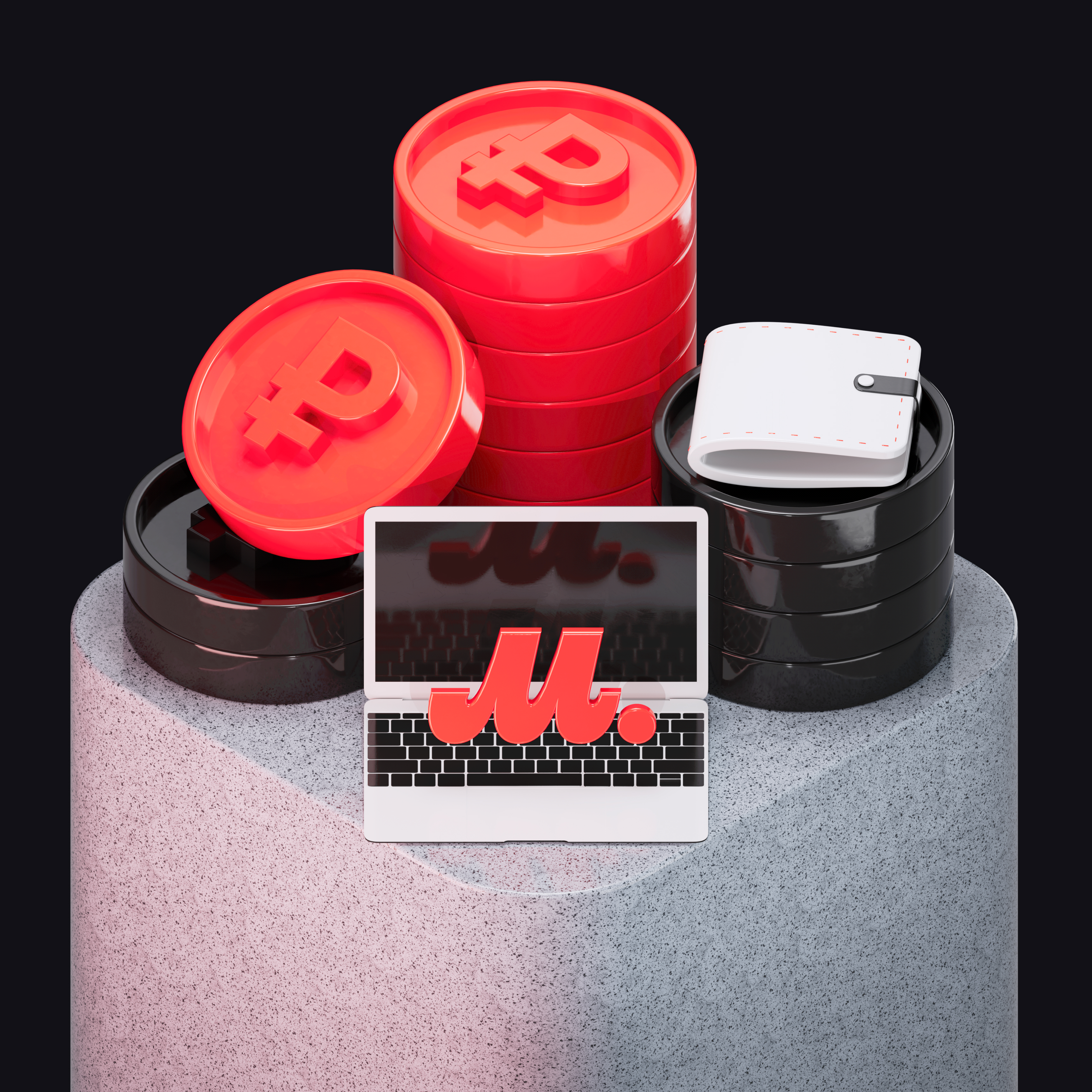
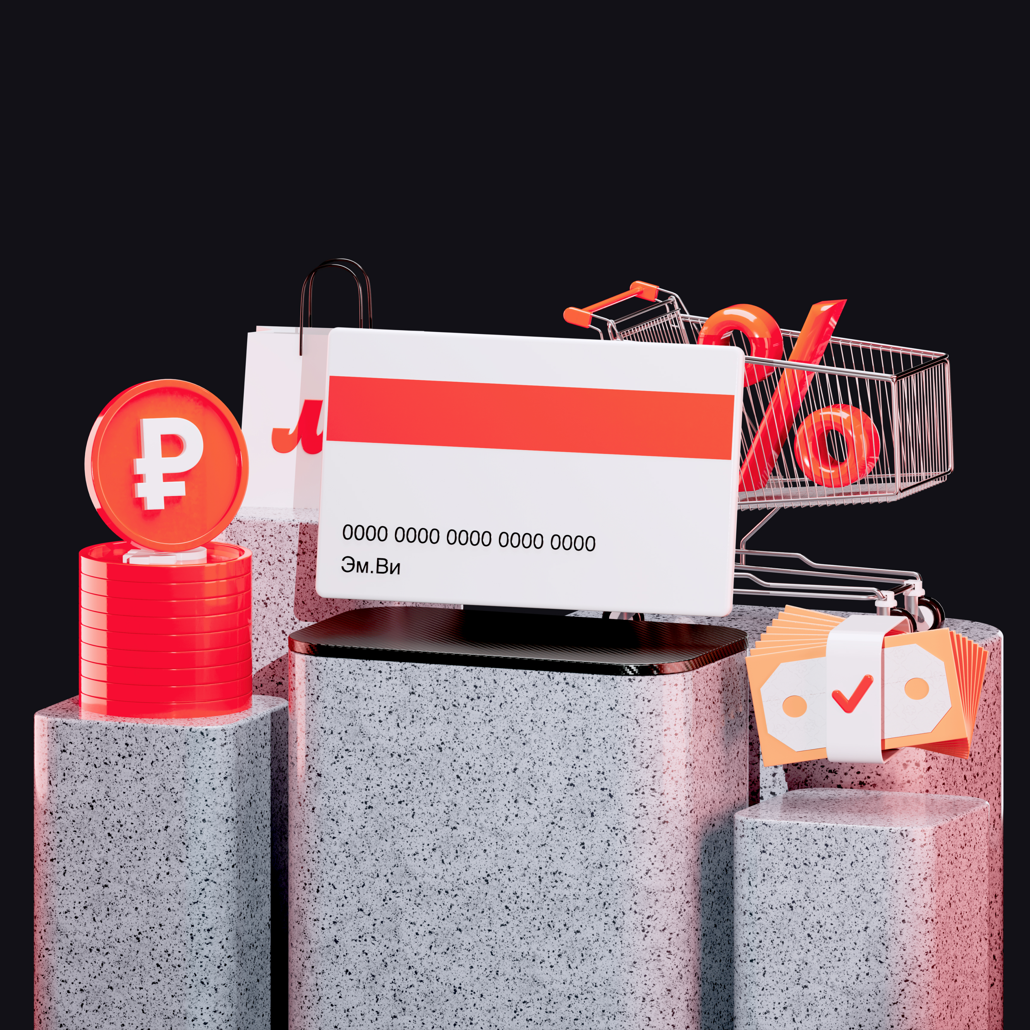
with 500 stroke icons, 500 solid icons, and a set of 31 3D icons created in Cinema 4D and Redshift.
Create a scalable design system for M.Video promo pages that would standardize page structure, unify visual language, and significantly speed up the production of new marketing pages.
The goal was not just to build a Figma library, but to create a connected design-and-code foundation with reusable components, clear guidelines, and predictable implementation. The system had to cover the most common promo page scenarios, reduce the need to design layouts from scratch, and help both designers and developers work faster and more consistently.
It also had to support the needs of multiple sub-brands, including M.Finance, M.Combo, and M.Master, while staying aligned with the updated M.Video brand direction.
In some cases, blocks were exported as JPGs and placed directly on the website, which clearly showed how broken the workflow had become.
On average, creating a single promo page could take up to 6 working days, and without a system many pages would still need to be rebuilt manually one by one.
The system was built as a modular framework for web promo pages and organized around a clear hierarchy:
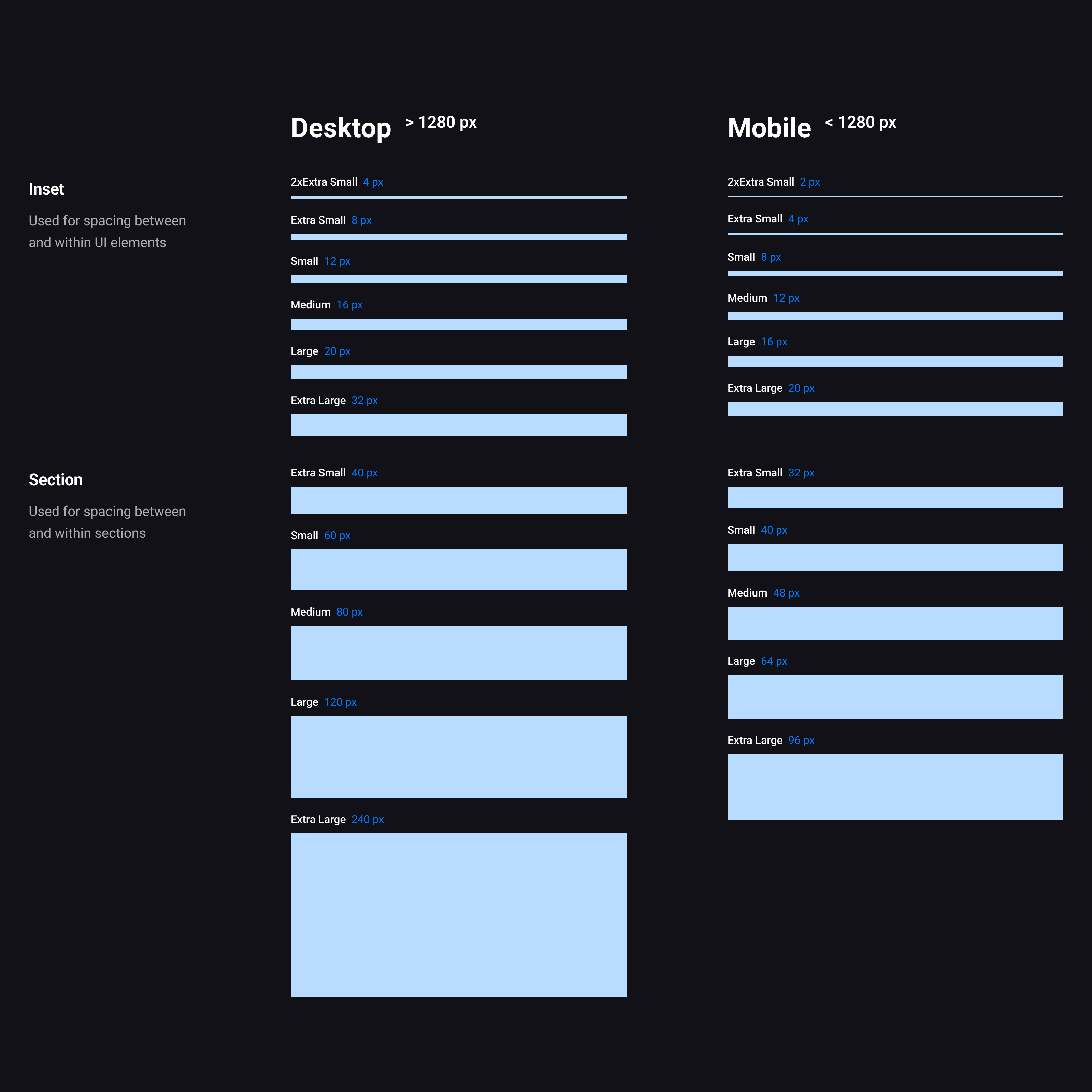
Core variables that define colors, typography, spacing
The smallest UI parts: icons, buttons and inputs
Groups of atoms forming simple components
Larger components made of molecules and atoms
Layouts showing how components connect within a structure
Final screens filled with real data and content
Inside the component library, elements were grouped by level, from atoms to organisms, making the system easier to navigate, teach, and scale.
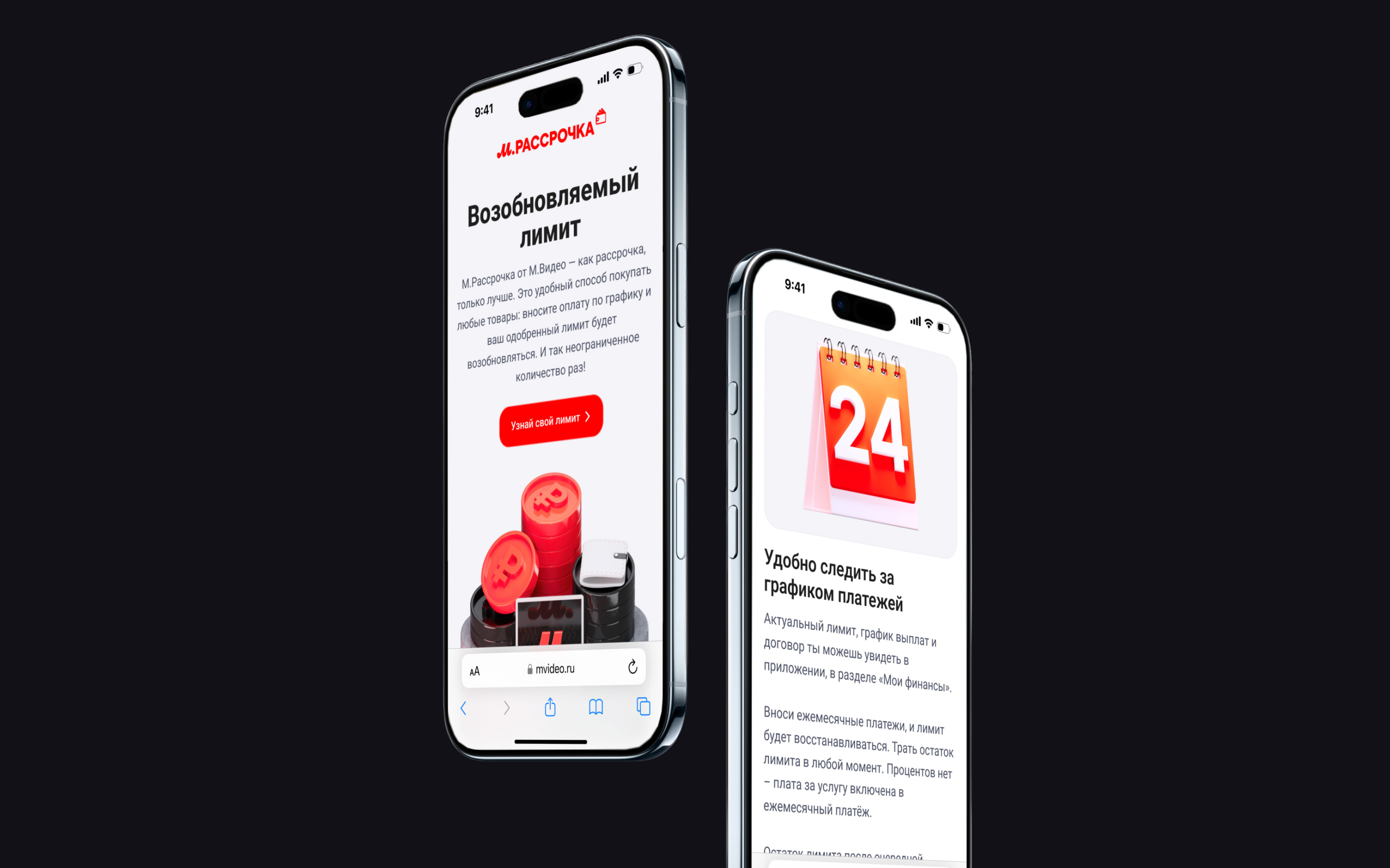
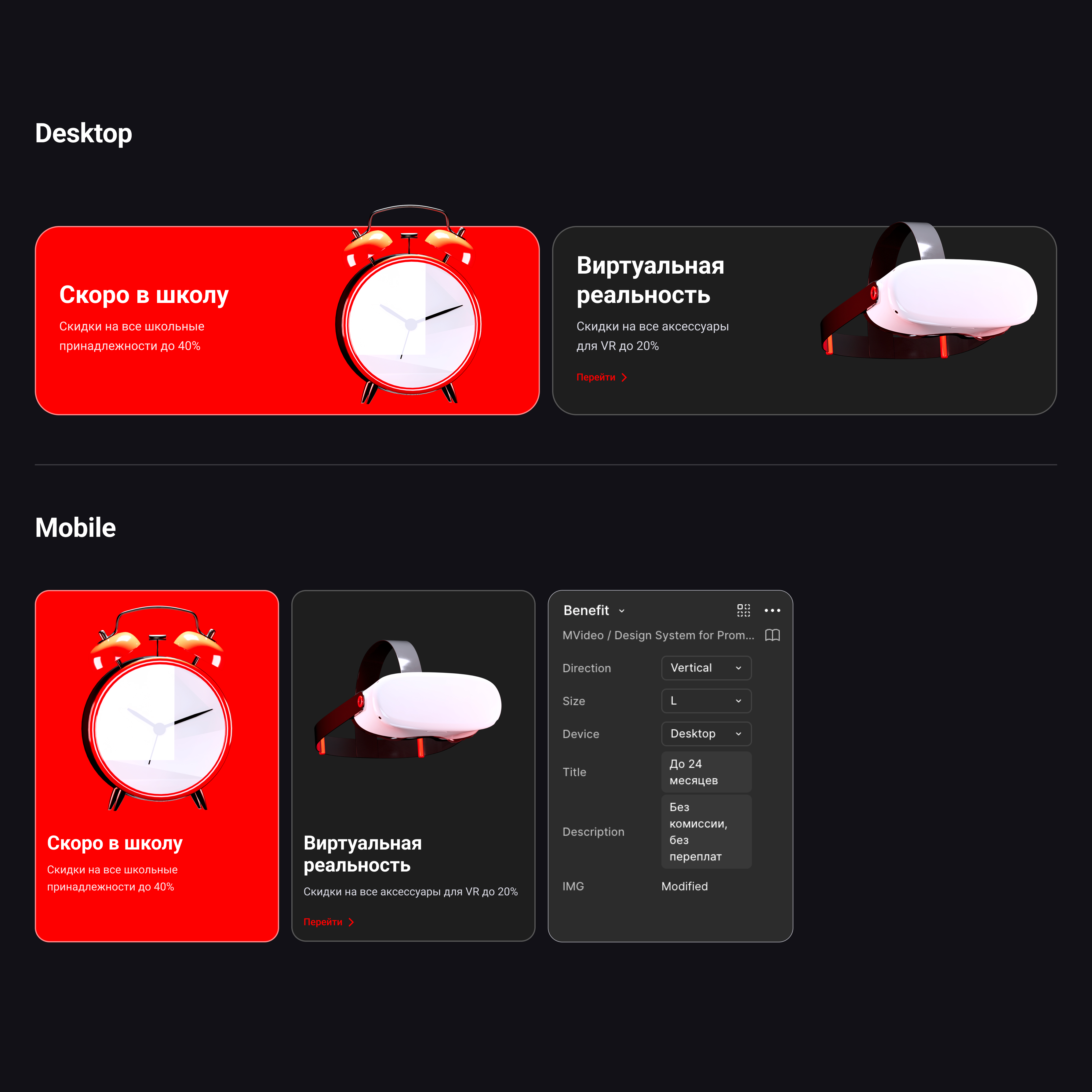
The system was also built with modes for desktop and mobile, with foundations and behaviors adapted for both.
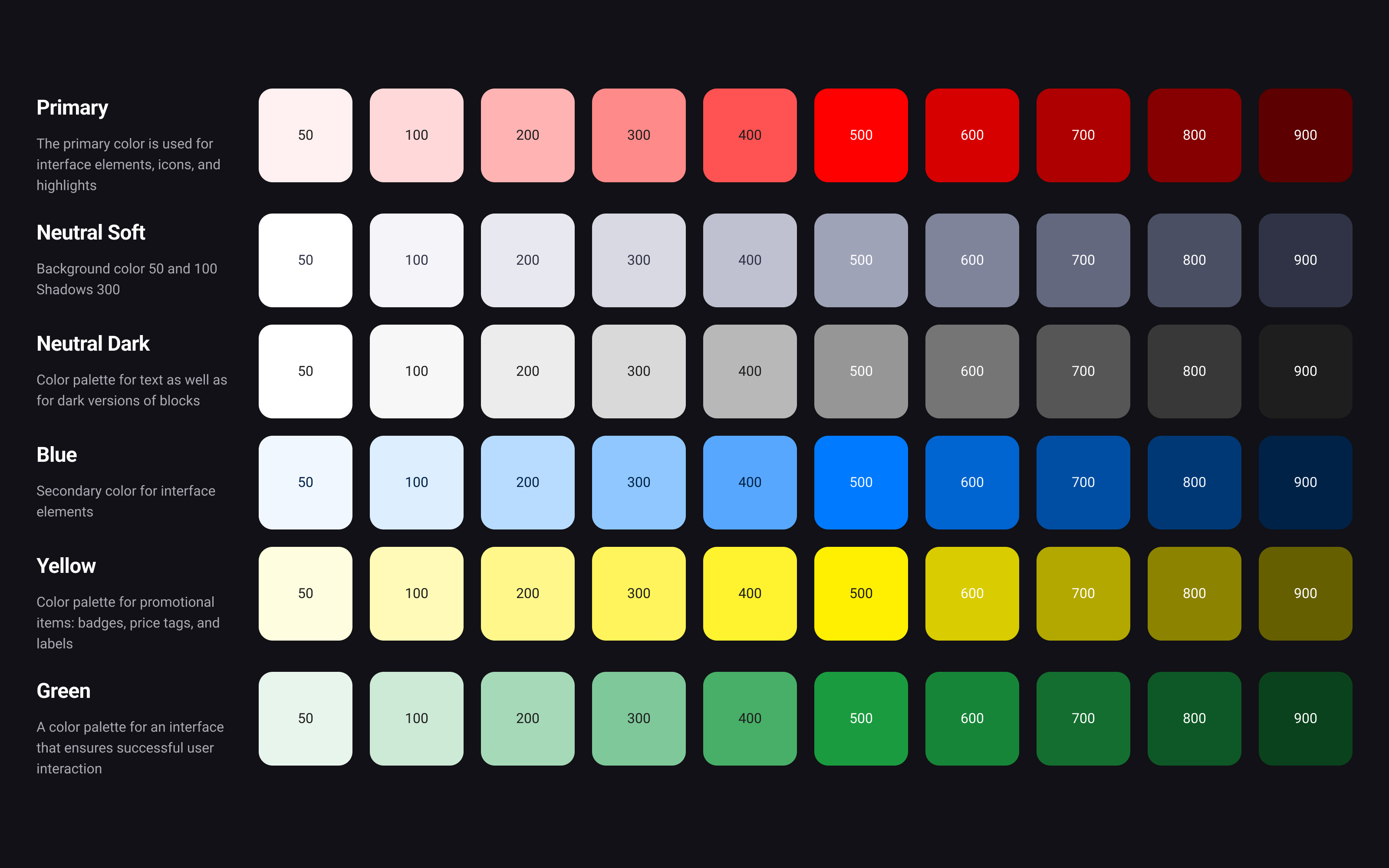
The system included 6 color palettes, each built with 10 shades. These palettes were translated into semantic variables for practical UI usage, including fills, titles, text, borders, success, error, and other states.
A separate neutral and dark structure helped support different content types and surface combinations. Each component also had multiple brand-aligned color options, including Red, White, and Black.
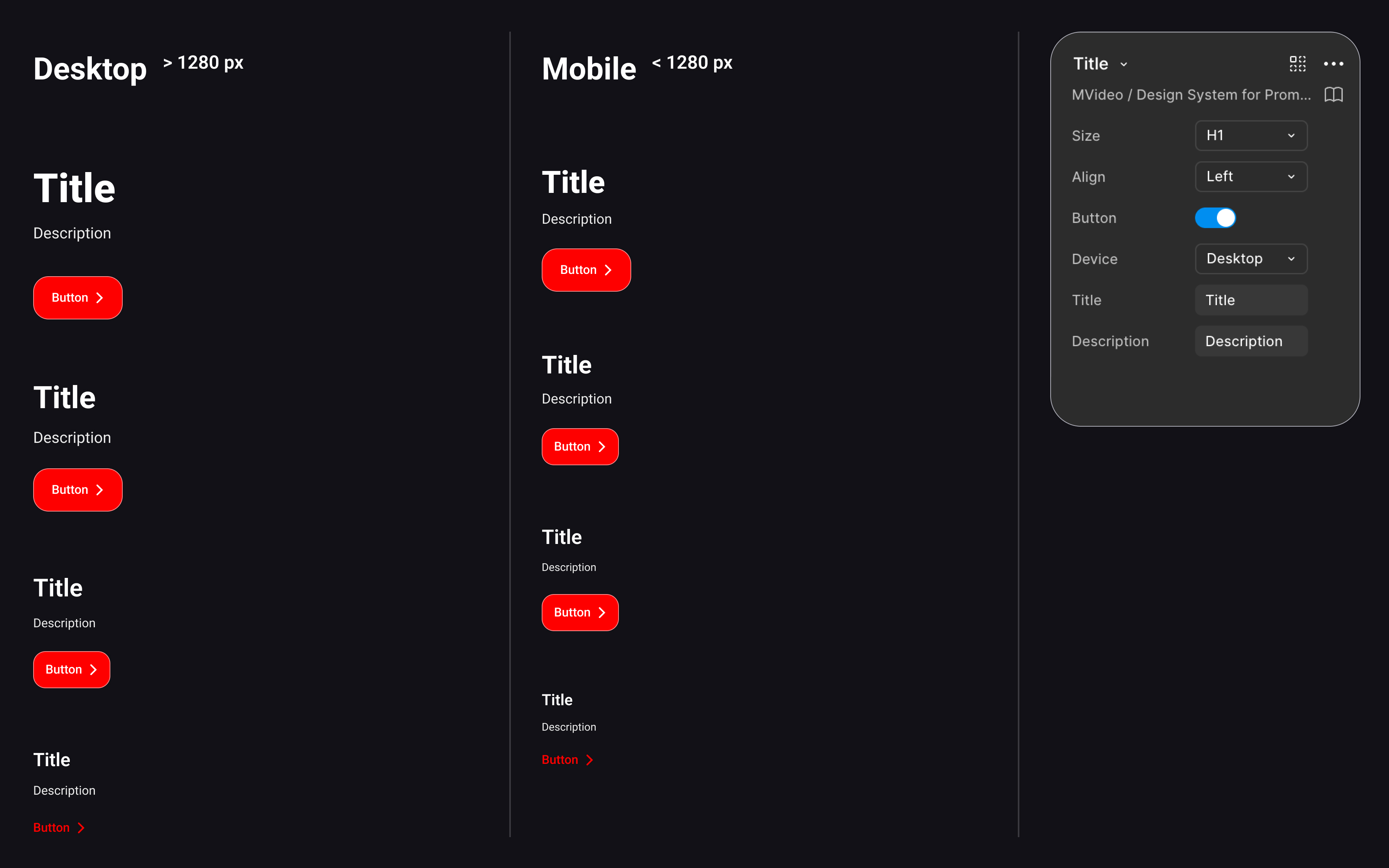
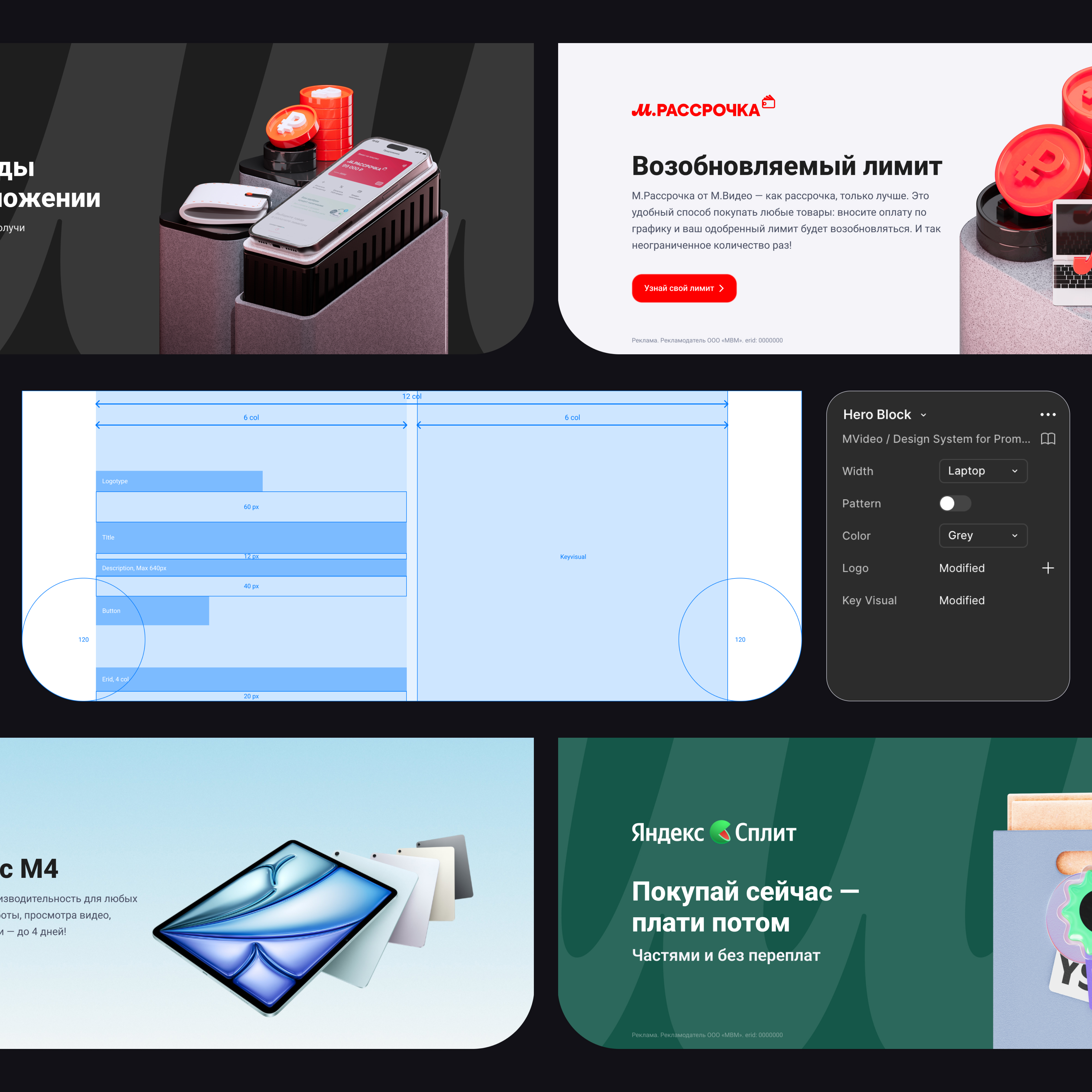
One of the key layout features was a reusable Section component that automatically adjusted container width depending on the screen size.
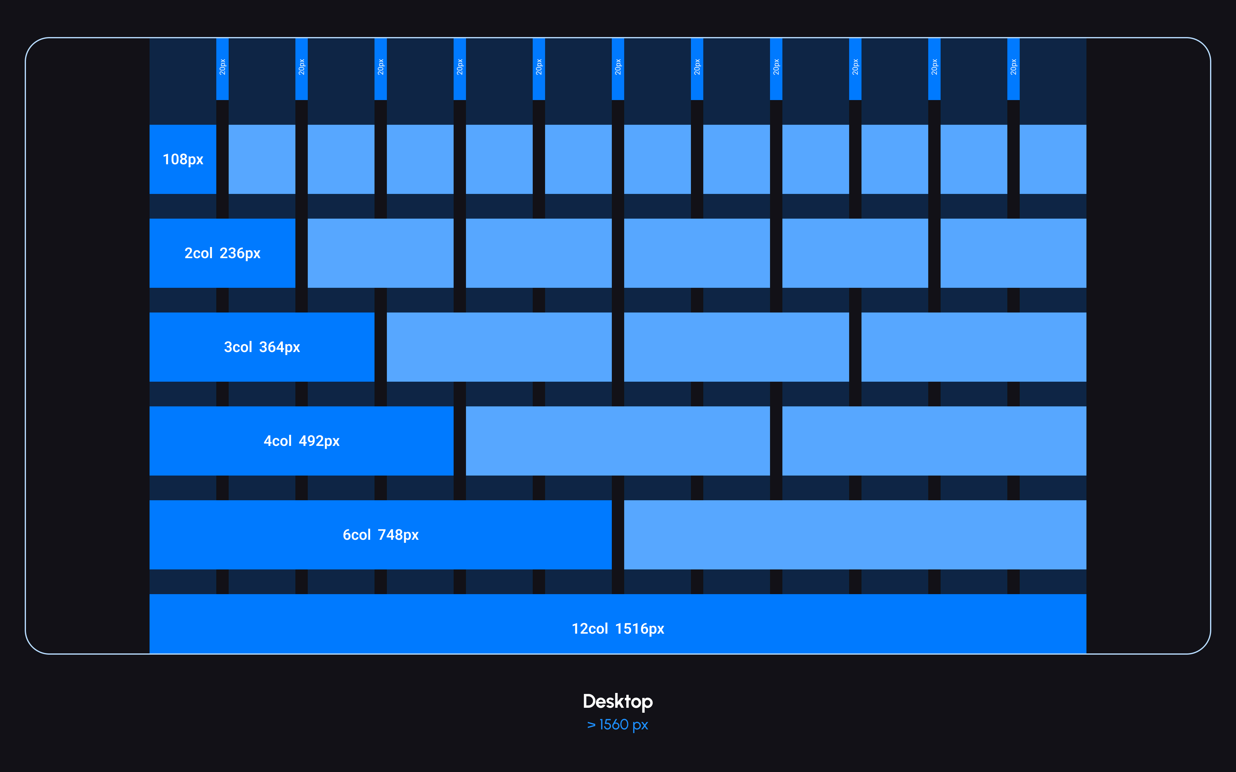
Originally, the system inherited a 24-column grid from product design, but it was later simplified to 12 columns. This made the promo page framework more practical and easier to use for simpler marketing layouts.
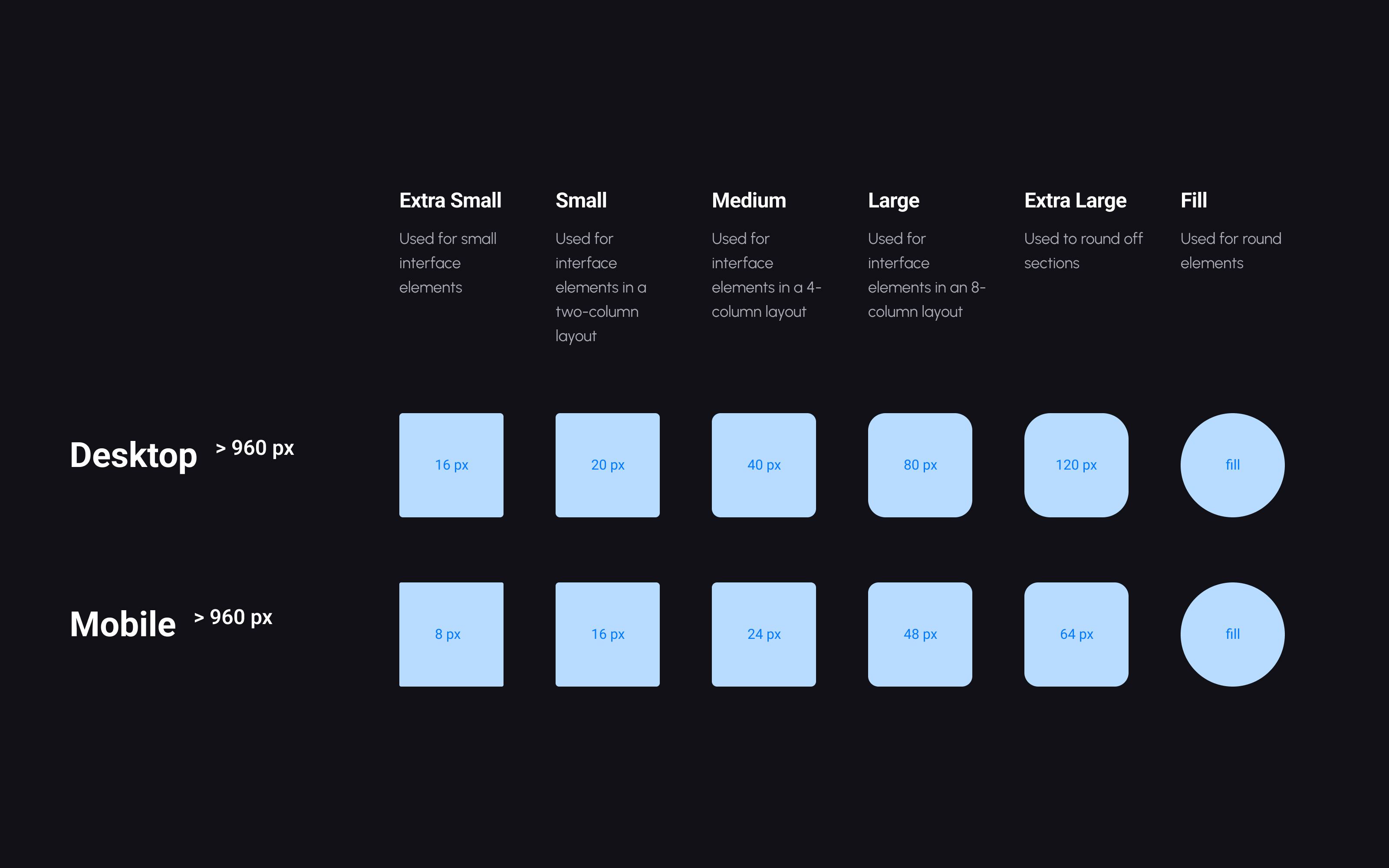
Radius values were grouped into XS, S, M, L, XL, and Fill, providing flexibility while keeping the visual language controlled.
The system also included 3 shadow levels — S, M, and L — and semantic border styles for different block types, color surfaces, and image treatments.
The library included around 20 core blocks, which expanded into 250+ component variations.
Some of the most important components were:
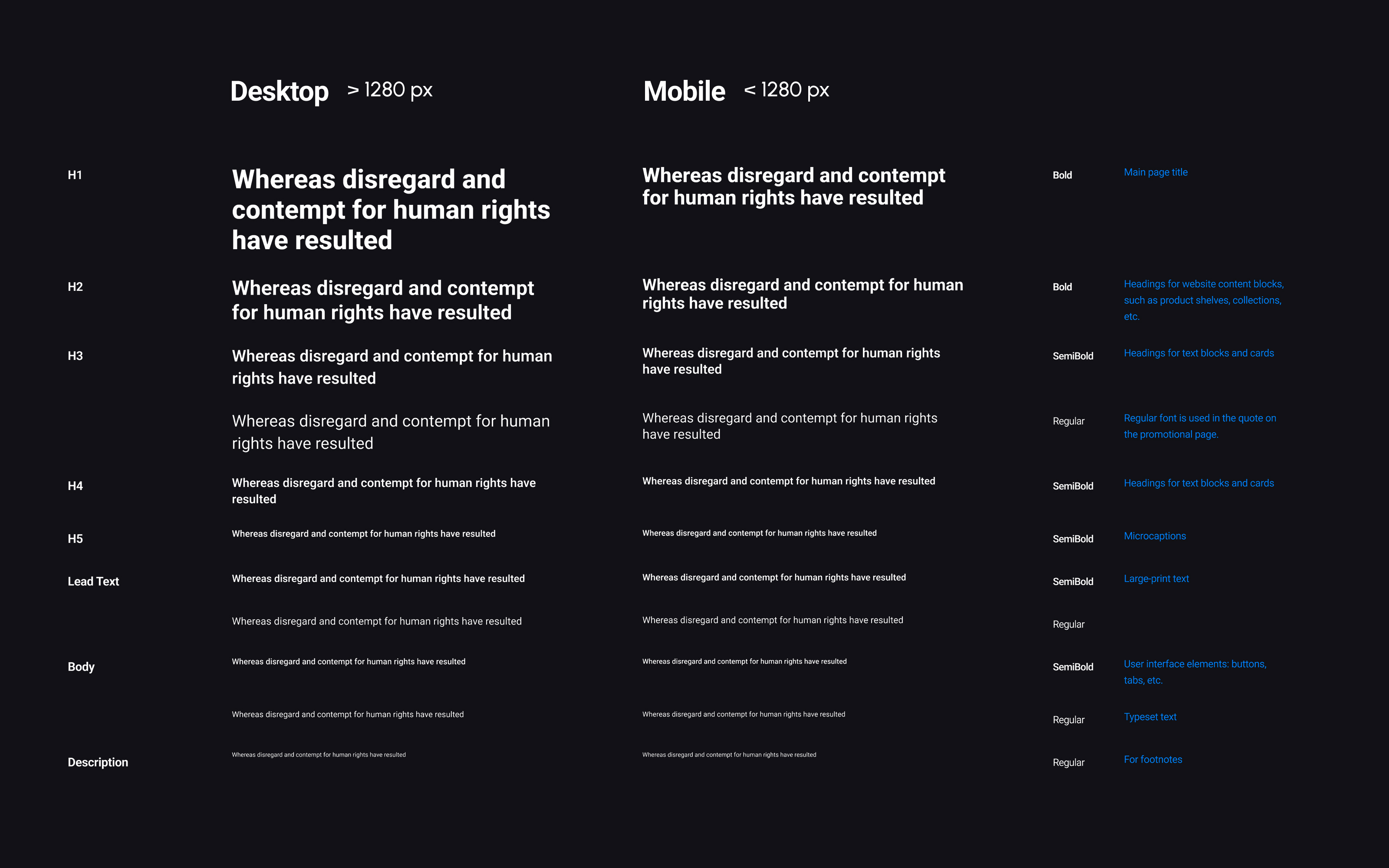
A foundational content component that controlled hierarchy and automatically adapted internal styles depending on the selected level, such as H1, H2, H3, or H4. Because it managed title, text, and button behavior together, it became a core dependency across many other components.
The main banner component used across promo pages. It relied on Figma Slots, allowing designers to insert different content into a flexible parent structure without rebuilding the block.
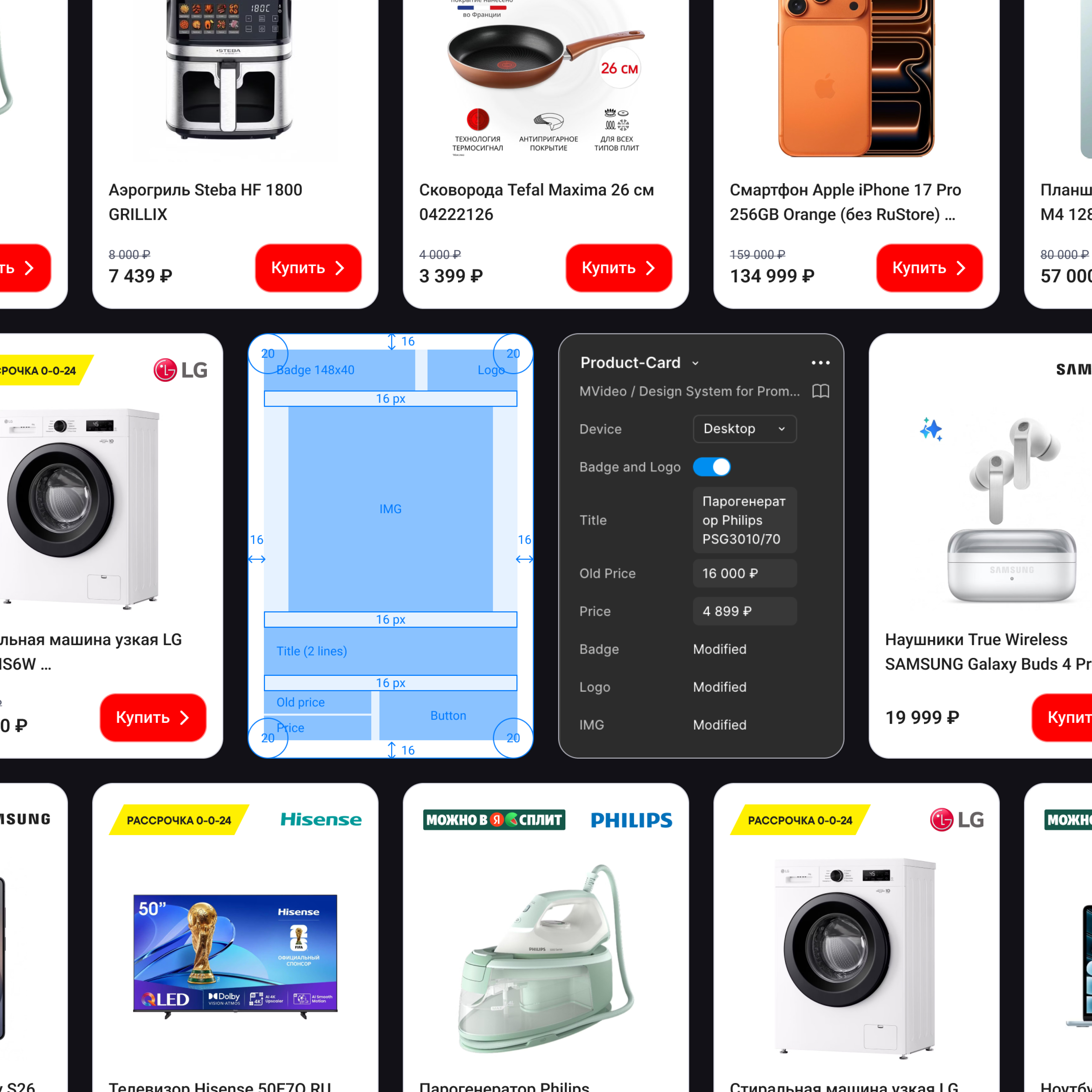
A key marketing component created from scratch to cover the needs of the commercial team and promo page structure. It supported consistent product presentation in a reusable format.
The system was fully built with Auto Layout, and more complex behaviors used Slots and Instance Swap to make components flexible without breaking consistency.
A good example of internal reusability was the image block, which served as a base container for aspect ratio, radius, and borders, and was reused in news modules and rich content blocks.
The system covered interactive logic in detail.
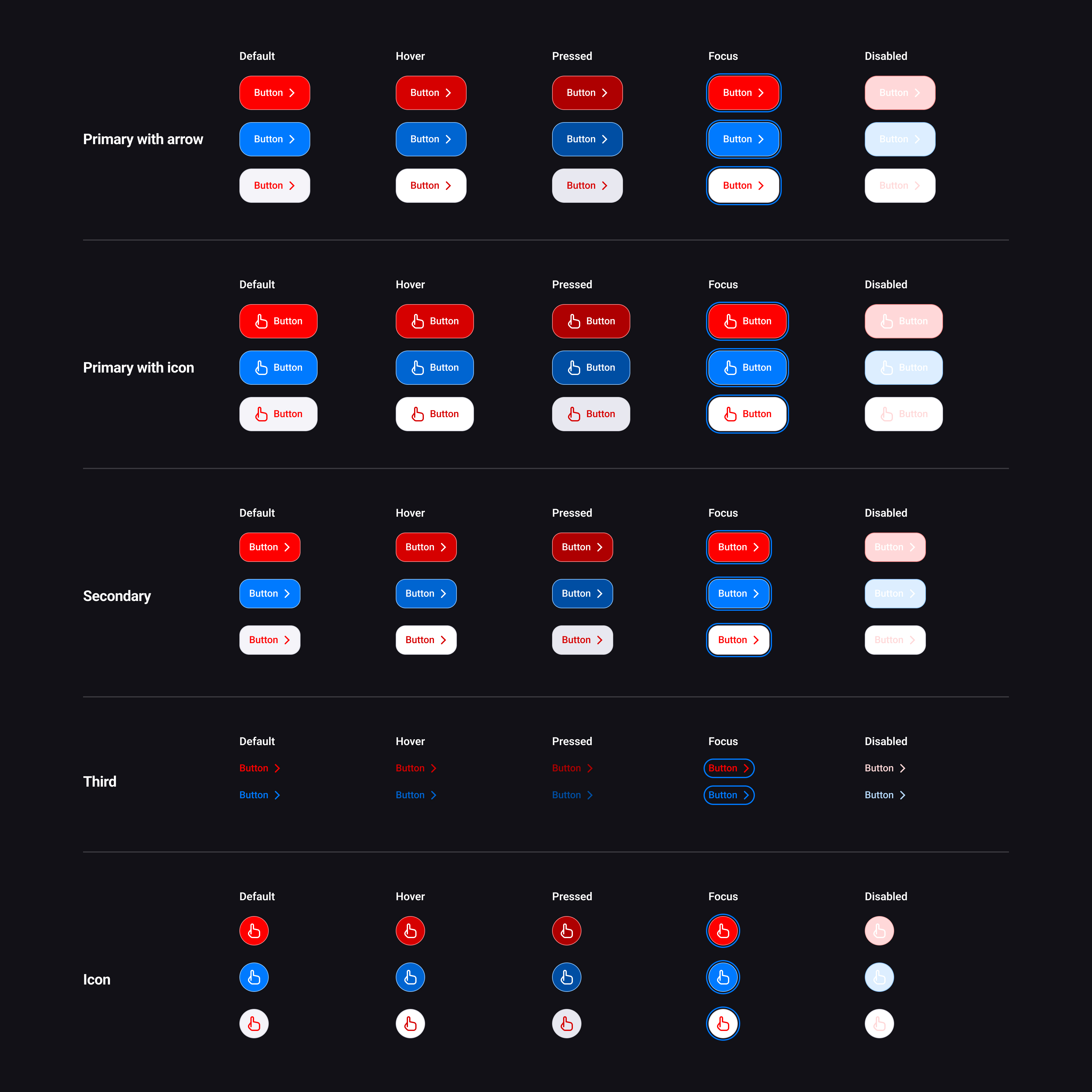
The button system was designed as a reusable and highly adaptable component set for M.Video promo pages. It covered the most common marketing and interface scenarios while keeping the visual language consistent across different page types and sub-brands.
The library included multiple button types, color modes, and interaction states, allowing designers to assemble pages faster without rebuilding CTAs from scratch. Each variation was created as part of a structured component logic, making the system predictable both in Figma and in development.
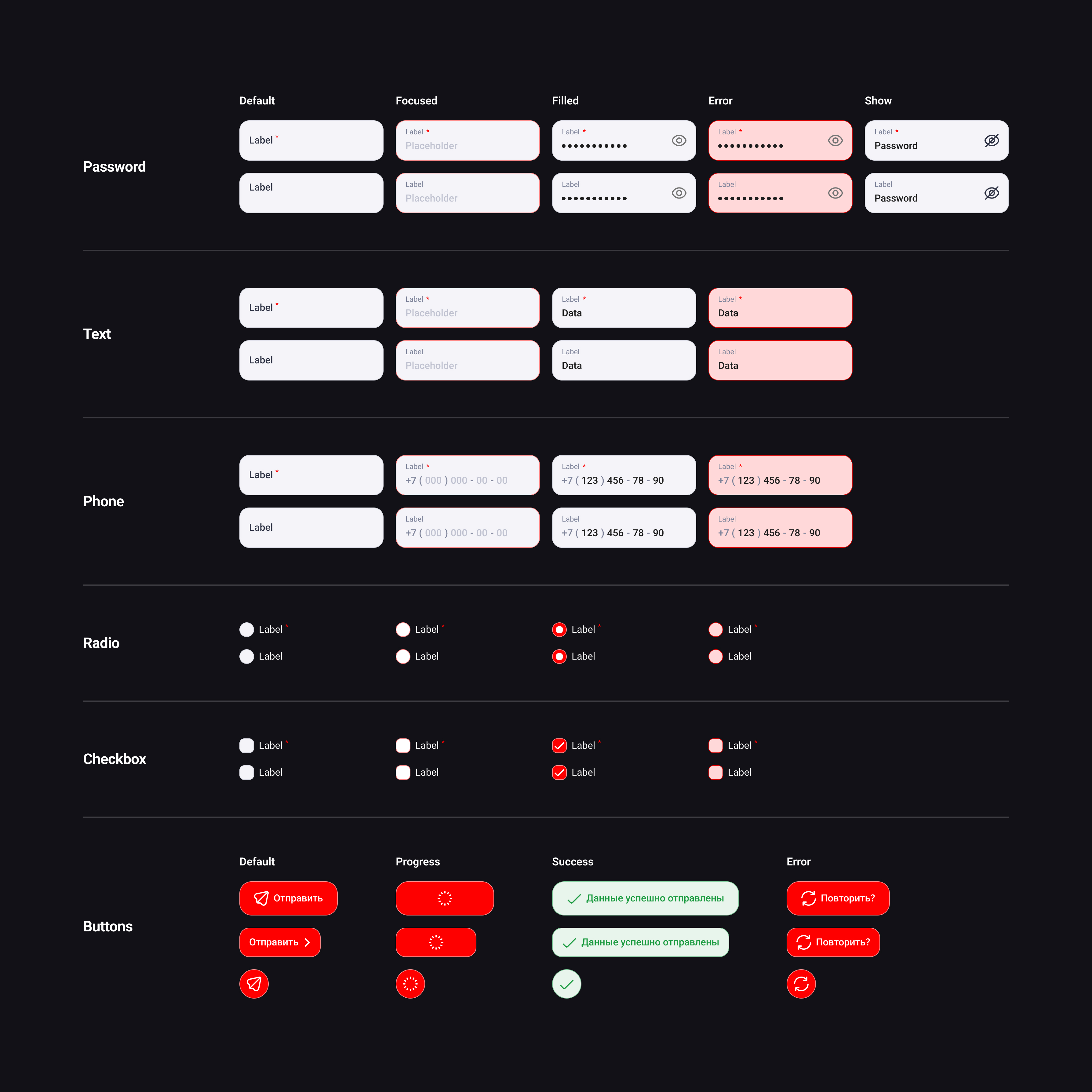
The forms system was designed to cover the most common data-entry scenarios across M.Video promo pages, from simple lead forms to more specific marketing and service flows. The goal was to make form elements visually consistent, easy to reuse, and predictable in behavior across both design and development.
Instead of treating each field as a separate one-off element, I built a modular input family with shared construction rules, unified states, and semantic feedback patterns. This made forms easier to assemble, easier to scale, and much more reliable in production.
Components above the atom level also had mobile-specific versions, helping the system adapt to smaller screens without rebuilding layouts manually.
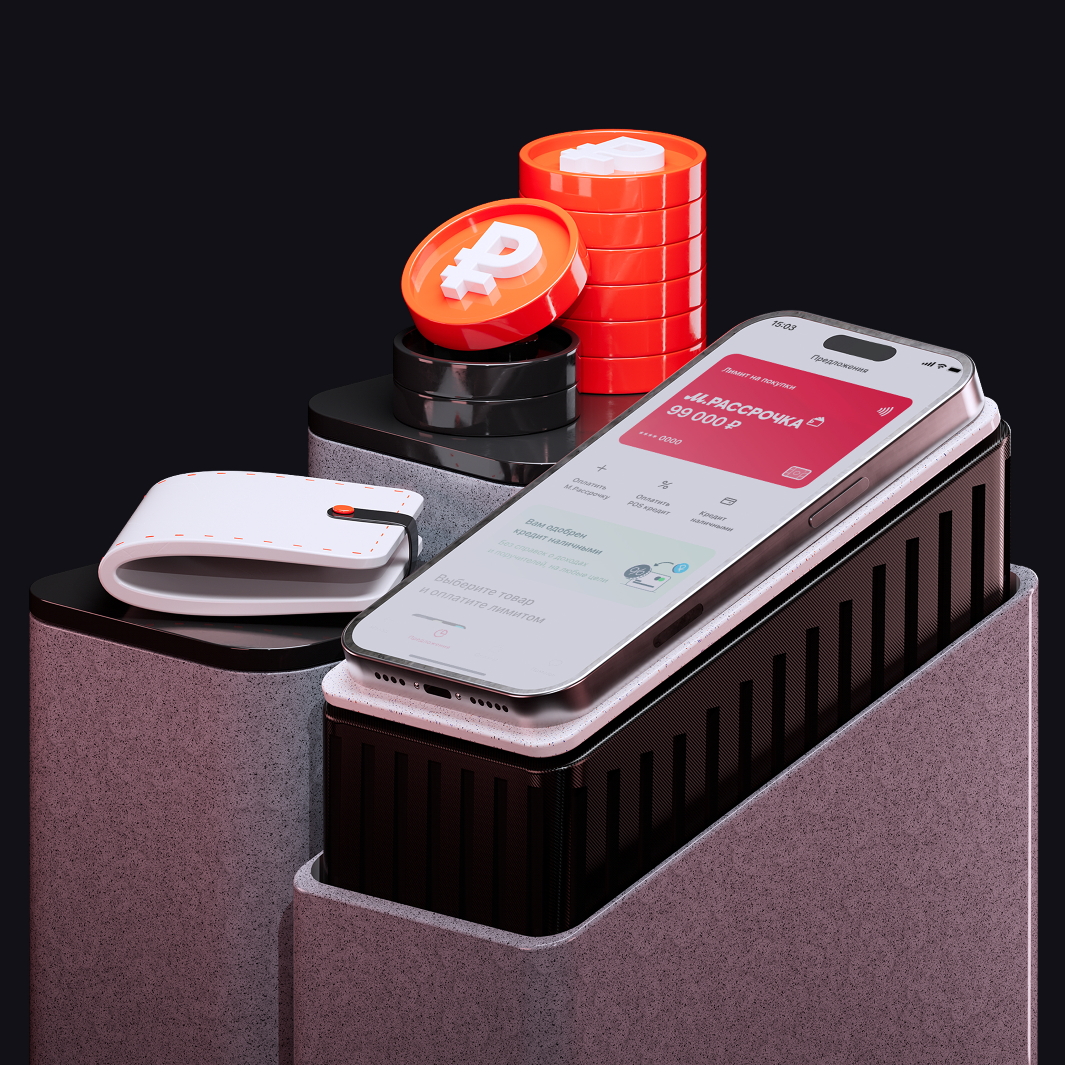
The 3D asset direction became one of the most successful parts of the system and received strong positive feedback both from management and from external stakeholders.
The project started with a practical experiment: I redesigned one of the typical promo pages and used it as a draft to demonstrate how the workflow could be improved.
At the same time, I audited existing layouts and identified repeated structures. Most promo pages followed a similar pattern:
This recurring structure made it clear that a modular system could cover most use cases.
The framework was then built around the realities of an already existing e-commerce platform. It had to stay compatible with the broader store ecosystem, but it was intentionally simplified to suit promotional pages, where interface complexity is usually lower than in product UI.
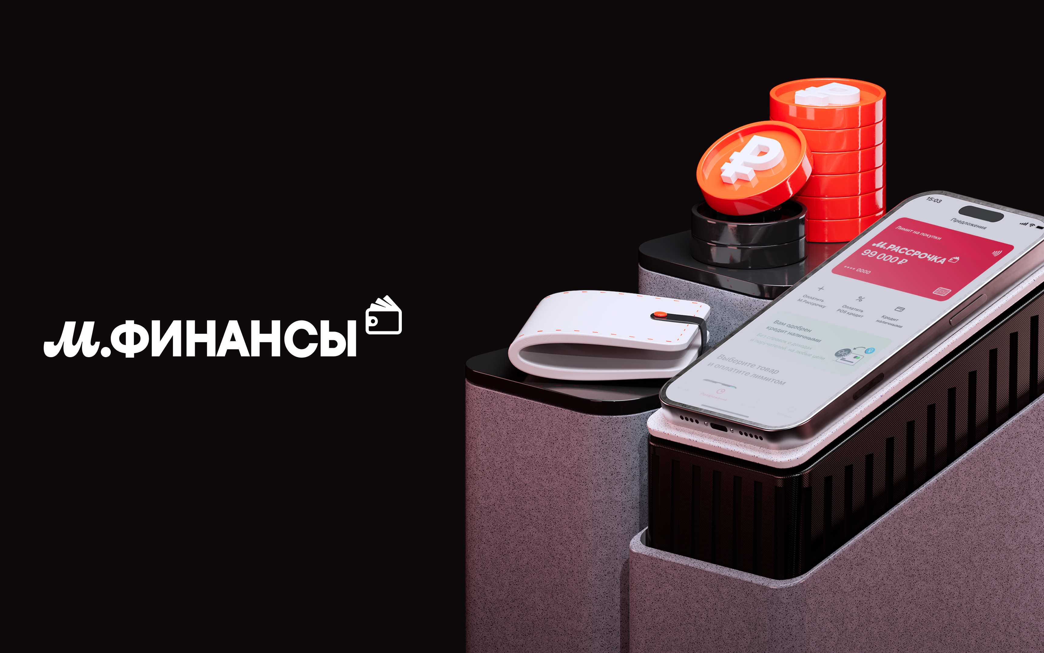
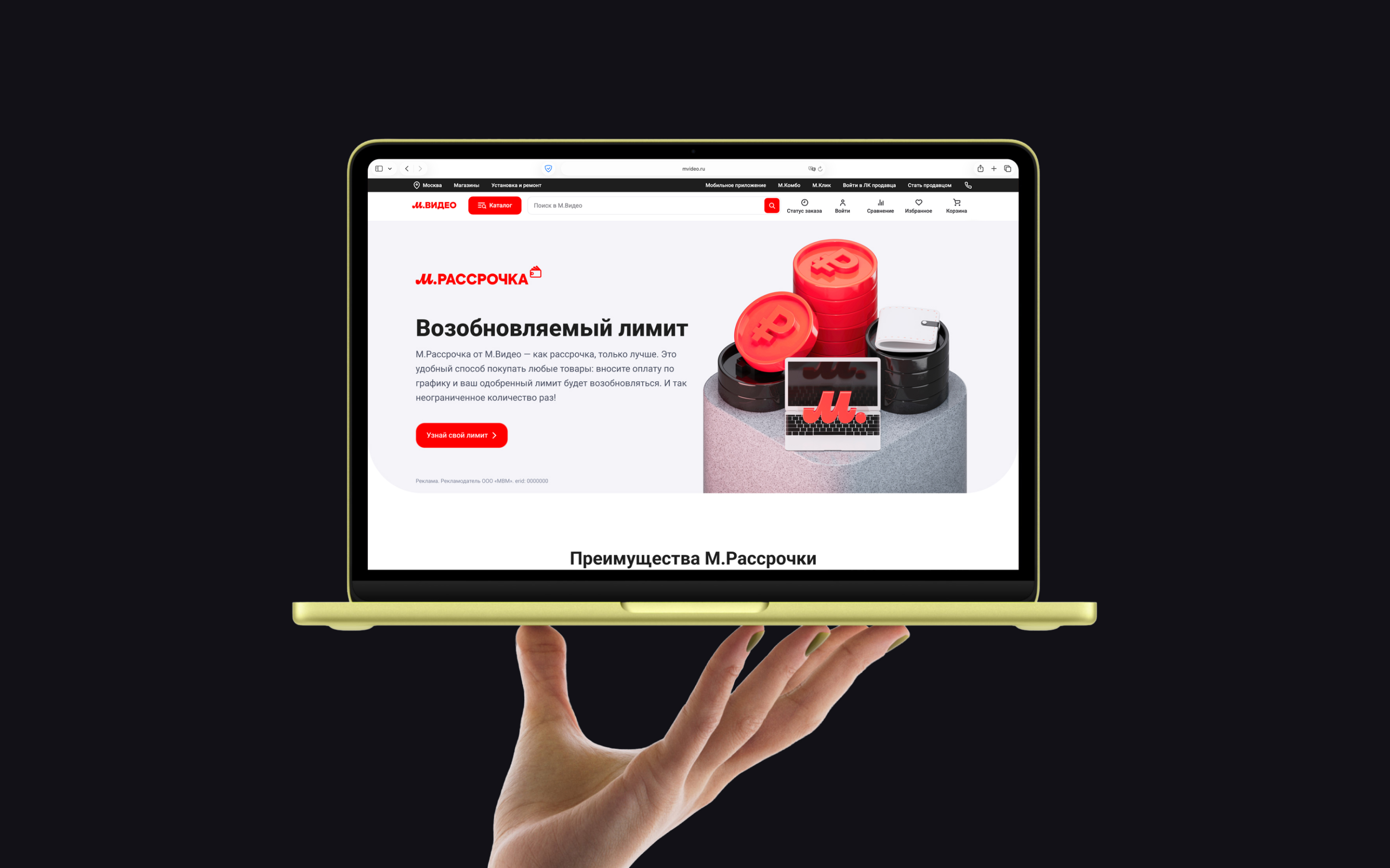
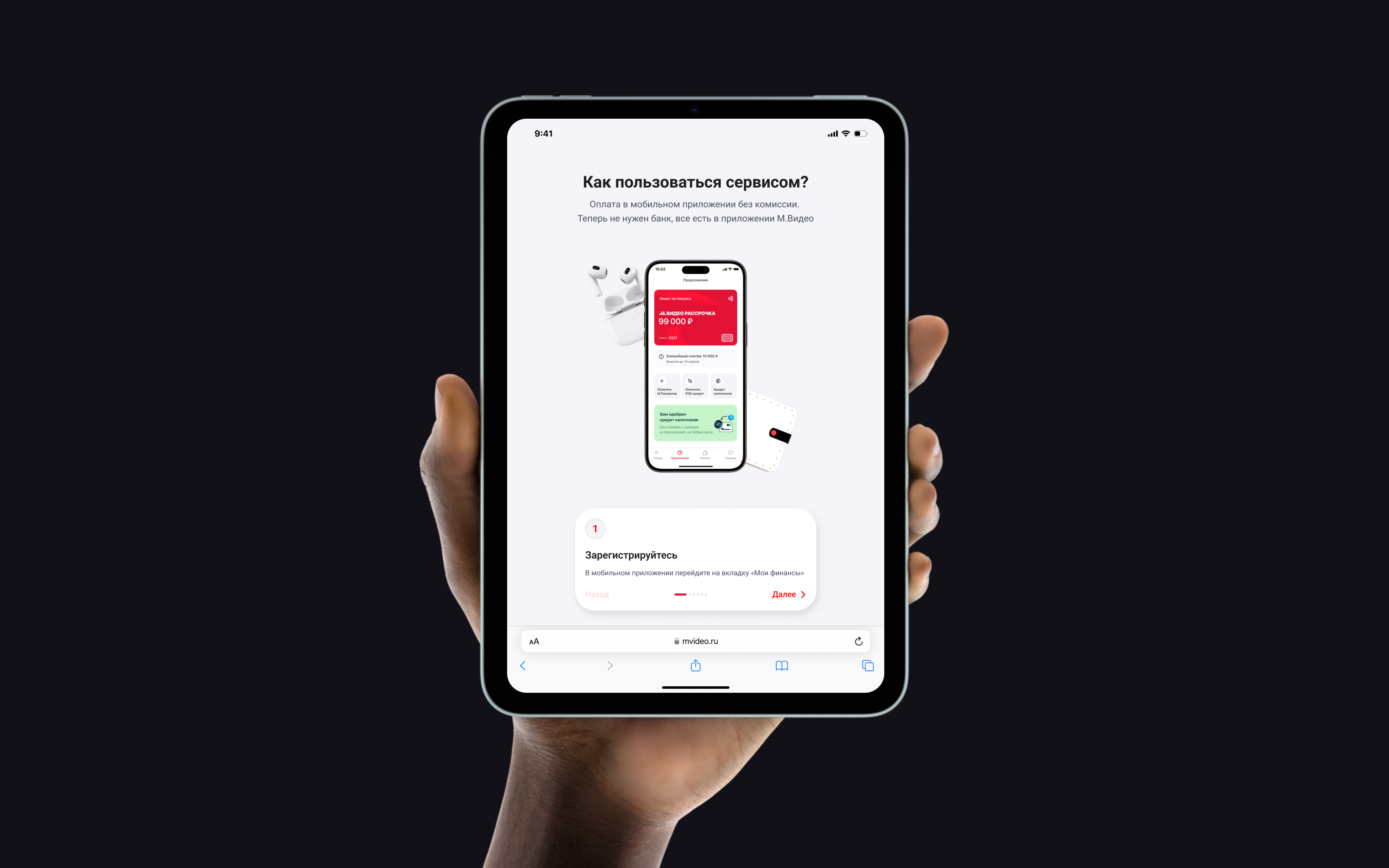
The system was introduced directly through real projects. One of the strongest proofs of its viability was the launch of the M.Finance section using this framework.
The system was not static — it evolved continuously as new pages and needs appeared.
The hardest part was not designing the components themselves, but making the idea real inside a large business and proving that it could genuinely improve production.
The key challenge was balancing flexibility and consistency. Promo pages needed a clear framework, but at the same time marketing teams sometimes wanted more expressive or unconventional landing pages.
There were also legacy constraints. Because promo pages lived inside the broader M.Video platform, the system could not drift too far from the established product environment.
Another important adjustment happened during development:
These compromises were necessary to keep the experience coherent across the website while the brand transition was still in progress.
This project taught me how to introduce innovation into a large organization and defend a systems-driven approach in a business environment.
It also reinforced several principles I now consider essential for a strong design system:
Looking back, I would invest even more into deeper semantic variable architecture and micro-interactions. That would bring the system even closer to the maturity level of top-tier design systems.
At the same time, one of the most successful decisions was moving from flat 2D graphics to a more expressive 3D visual language, which made the pages more distinctive and memorable.
The design system transformed promo page production into a much faster and more predictable workflow.
Visually, promo pages became unified and aligned with the brand refresh. Operationally, the system reduced repetitive work, simplified handoff, and made implementation much more consistent.